Three Colors. One Mission. For the 22.
A new look. The same commitment. A stronger sense of purpose.
Since launching For the 22, I've been working to build something bigger than a fundraising campaign. I want this to become a movement that brings people together, creates meaningful connections, and turns awareness into action for veterans, first responders, and their families.
As the campaign has grown, so has my understanding of what its identity should represent.
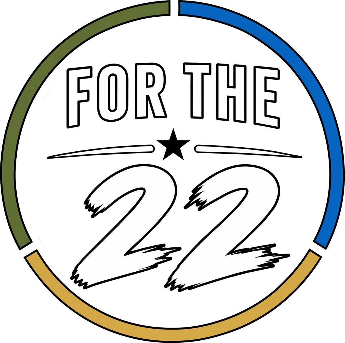
Today, I'm introducing a refined For the 22 logo. The change may appear simple, but the meaning behind it is anything but.
Our original design featured a colorful, segmented ring representing the many communities connected to our mission. While that design served us well, I wanted something more intentional. Something that could communicate who we're fighting for without needing a dozen colors to tell the story.
The new design features three colors, each carrying a distinct meaning.
Ranger Green — For Those Who Serve
Ranger Green represents our military veterans. Their courage, sacrifice, resilience, and the challenges that don't always end when their service does.
It honors those who have worn the uniform, those still finding their way after taking it off, and those we've lost along the way.
Blue — For Those Who Respond
Blue represents our first responders: law enforcement officers, firefighters, emergency medical personnel, and others who answer the call when their communities need them most.
Their service often comes with invisible burdens. Their sacrifices deserve the same recognition, compassion, and support.
Muted Gold — For Those Who Stand Beside Them
Gold represents the families.
The spouses, children, parents, siblings, and loved ones who carry burdens of their own. Those who endure the deployments, the dangerous shifts, the empty chairs, the difficult homecomings, and the long road toward healing.
They may not always wear the uniform, but they share in the sacrifice.
Gold recognizes their strength, their devotion, and their indispensable role in recovery and resilience.
One Ring. One Mission.
The three colors come together in a single, unbroken circle, reflecting a truth at the heart of For the 22:
None of us carries the burden alone.
Veterans. First responders. Families.
Different experiences. Shared sacrifice. One community.
This change also reflects my commitment to being a responsible steward of the resources entrusted to this campaign. A more focused visual identity allows us to simplify merchandise production, reduce unnecessary expenses where possible, and direct more of what we raise toward the people and organizations we're here to support.
Because every dollar matters.
And because the mission has always been bigger than the merchandise, the events, or the logo.
Because 22 ≠ 0.
Thank you for being part of this journey, for believing in what we're building, and for helping turn a simple idea into something that can make a difference.
Movement Creates Momentum.
— Founder, For the 22